Tuesday 20 March 2012

Blog 10: My Team Logo


Introduction

Hello all it has been another full on crazy week with deadlines, new briefs, etc. For this blog I will be showing some rough concepts for my sports team inspired by the Greek god Hercules along with all of the other research that has been covered in the blogs leading up to this one.

Sports Team

After a long time of consideration I have finally decided on my sport and the type of team I want to design a logo for. The logo that I will be designing is for the Australian Olympic Rugby Sevens team. 

At this point in time the team does not really exist but will be a team that will be building up more popularity and support in the lead up to the commonwealth games in 2014 and the Rio Olympic games in 2016. It may surprise some to know that Rugby Union has not been in the Olympics since 1924.

Concept one

Copyright 2012 Andrew Weegberg


After using a new method of brainstorming trialled in class I found my design going in another direction. In this concept I have focussed on using Hercules Shield as a way of framing the logo. 
Unfortunately the look of the shield has been lost and not many people would notice.

The design may look a little boring but does serve a practical purpose in the fact that it will be easy to reproduce on product like T-shirts (which is another consideration for this logo) I do believe that more work needs to be done on this concepts to develop it further to my usual high standard.

Concept Two

Copyright 2012 Andrew Weegberg 


Once again I have tried using the shield of Hercules to make the logo with no real success. In on of my other thumbnails I wanted to incorporate the Southern Cross or the Eureka flag in the logo with another shield shape. My only concern for doing this idea is that I could not come up with many solutions that did not look like the Melbourne Rebels logo which for those who don’t know in another Rugby Union team.

I like this concept better as the typography could be really strong. I do feel that more work is needed, as this is nowhere near resolved just yet.

Concept Three

Copyright 2012 Andrew Weegberg


For this concept is decided to try an incorporate an image of Hercules in the logo. I don’t want to make it known that it is Hercules in the logo instead I have drawn warrior and named the team the Warriors. 
This refers directly to Hercules, as he was a great warrior and seems appropriate for a team name, as most Australian animals have been taken to name other Olympic/ National sporting teams. 

Another reason behind the name is that Rugby is a fierce and competitive sport played against some big and somewhat scary nations. I thought it would be good to have a team could sound and eventually look scary.
The addition of the flag is something that would be good to have, as it is a very good source of national pride. This is something that can be removed or left if the concepts are developed further.

Possible typefaces

Headings

Dax Condensed
Fago Extended (Really like this typeface)
Eureka Sans
Kievit Two (Really Liked this typeface)
Meta Two
Signa
Celeste

Bodycopy

Meta Two
Celeste
Info Text
Rekord (would be good for a sub head)
Schulbush
Zine Serif

Possible Colours

The Picture below is a very rough and basic representation of what the colours in the logo could look like. I do apologise for the kiddy style colouring in but it was meant to be a very quick and rough representation. More consideration will take place once the final design has been developed and decided on,

Copyright 2012 Andrew Weegberg


Green and gold

As this is an Australian Olympic team the colours have sort have been chosen for me in previous Olympic games and other national sports such as the Rugby world cup the colours are always Green and Gold.
It is my intention to use these colours in a way that appears different to colour schemes in the past. The one major concern is to make sure it doesn’t look to similar to the South African Olympic teams as they too have the same colours with different variations.

Any feedback on any of these rough concepts would be greatly appreciated. Please remember these are very rough thumbnails that are still in the early stages of development.

Until next blog

Andrew Weegberg


Tuesday 13 March 2012

Blog 09: Culture in Design


Introduction

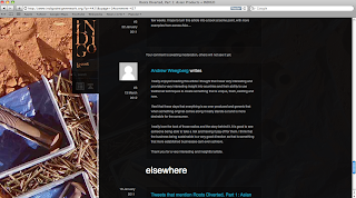
This is a very short blog. The task that I had to do was read through an article posted on http://www.indigodesignnetwork.org/ and post a comment on that article. Once I had done that I needed to post a link to the comment and the article on my blog site.

To view the article I read and the comment please click on the link below


As I post this blog my response is awaiting approval for the website to be published so as proof of me doing this comment I have also taken a screen capture of the comment on the sight.


A close up view of what I wrote.


Until next time fellow bloggers I hope you have enjoyed reading and it was helpful.

Andrew Weegberg

Blog 08: Aboriginal Motifs


Introduction

For this blog I have to imagine that I have been hired to design a logo and promotional materials for an Aboriginal community based football team. The following is a description of how I would go about the design to insure that it stays within the guidelines and protocols of the aboriginal communities.

Functions and Responsibilities

Protocols

When dealing with Indigenous cultural material there are certain protocols that must be met. This includes the way in which you interact with the community whilst respecting their knowledge, expressions and preservation of their culture.

It is important to remember the diversity and complexity of the various aboriginal cultures and that they can vary from once community to the next.

Principles

The protocols of the indigenous community are shaped around the nine principles and are listed below.

1.     Respect
Refers to the rights of Aboriginal people to over see their heritage in all areas such as images, designs, art, etc.

Some of the protocols that are associated with the principle Respect are…

Acknowledgement of country

The indigenous Australians and Aboriginal Torres Strait Islanders are the original owners of the land in Australia. It is because of this they have a very strong bond with the country and the land their ancestors lived on.

It is a common protocol for the organising of an exhibition, installation, etc. That the original land owners of that part of country are invited to attend and have a representative present a ‘welcome to country’ address.

2.     Indigenous control
Refers to the right indigenous people have in the control of cultural affairs and the presentation of cultural material.

3.     Communication, consultation and consent
It is important to continuously communicate and consult the Indigenous people in regard to visual projects. It is also important that all necessary consent has been given if traditional works are to be used.

4.     Interpretation, integrity and authenticity
Refers to how the Indigenous artist and the communities have control of how their heritage is to be displayed in a manner that doesn’t undermined their integrity.

5.     Secrecy and confidentiality
Some of the material within Indigenous culture is not suitable for release to the general public in any format given they are matters that should remain confidential. It is recommended anyone who is putting something together to be displaying to the public should discuss the restrictions with the ingenious community.

6.     Attribution and copyright
Refers to the relevant indigenous groups being attributed for the usage of the heritage and culture in any format e.g. Paintings, etc. It also refers to indigenous people being recognised for the work along with anyone who has contributed to it.

Protocol for this principle is to abide by the current copyright laws where it is very specific in the acknowledging of the creators and what rights they are entitled to. The copyright laws cover a wide range of scenarios such as licensing, the use within certain institutions such as libraries and conditions for the reproductions of works.

Another set of laws that applies to these work and is covered in the copyright act is the moral rights laws. These are a set of laws allows for more fairer to be made whilst giving the creator more right over the content.

7.     Proper returns and royalties
Refers to the rights in which the indigenous people have a right to receive royalties and combination for the use of their cultural heritage. This usually comes in the form of money but other items can be arranged as an alternative method of payment.

8.     Continuing cultures
Refers to the continual process of consulting the various communities in order to maintain an ongoing working relationship that allow for easier communicating with any other jobs present or future.

9.     Recognition and protection.
Refers to the ownership of the copyright to the artwork by the artist and the various conditions it has set upon it.

Moral Rights and Issues

This is a subject that should not be taken lightly as there are a vast amount of restrictions placed ton the reproduction of indigenous heritage and their culture.

The use of motifs such as earthy coloured dots characters such as the rainbow serpent are all protected under copyright and the moral laws listed above. If such motifs were to be used with a design that I was undertaking this is something that I would have to seek approval from the custodians of the community and work close with the various groups in order to be able to produce works that maintain their culture and heritage in a way that was not detrimental or offensive to the indigenous community.

I would also have to attribute any artist that helped me on this project and or works that were used. At not stage could I claim ownership of the artwork unless some arrangement had been made that was deemed to be fair by both parties.

It would also be essential to maintain a good line of communication between the various groups throughout the project so that any issues or concerns can be raised and fixed in the timely and appropriate fashion. The on going communication between the parties also aid in the creation of a positive working relationship that could be carried on to other jobs later on should they arise.

Personal Note

I would like to add that regardless of the client would always do these things and abide by any cultural rules or laws that they may have. I see these issues as something this should be treated with a great deal of respect.

As for the condition of copyright I find it very good practice to constantly refresh my knowledge, as there are always new things to learn. When comes to these laws most if not all come naturally to me as this is something that I deem to be fair and the correct course of action in any job.
It is the process that I would expect have done to me should someone want to use my work for one of their projects.

I see these laws as something that should be well respected as it can lead to serious implications if they are not followed.

Bibliography

Web


Protocols for producing Indigenous Australian visual arts (PDF)
Australian Council for the Arts
372 Elizabeth Street, Surry Hills NSW 2012

Blog 07: Native American Motifs


Introduction

Welcome back to my blog. In this blog and a few of the following blogs I am looking at logos and motifs that can be viewed as controversial. All of this research is going toward my logo design and aid in making it culturally aware.

The logo that I will be looking at in this blog is the Cleveland Indians. This team Features in the Major League Baseball Series in USA.

So lets get started.

Cleveland Indians

Team Name:

Cleveland Indians. (Were originally known as Cleveland Blues and Cleveland Naps)

Logo

Since being known as the Cleveland Indians in 1915 this baseball team has undergone a series of logo changes to get to the one that they use today. The link below shows the logos the team has used in their ninety-seven year history.


Concept/ Theme:

The concept behind this logo is to move away from a text-based logo, which can be viewed as boring, and use a Picture based logo to promote the team.

The use of a picture based logo for the team is not uncommon as a majority of the teams within the Major League Baseball Series (MLB) use a picture-based logo for their team. This is also a very common theme for sporting teams regardless of the sporting code.

The Cleveland Indians logo is one that is unique and interesting, as it doesn’t have any text in its official logo for the team. A lot of the logos used in the MLB either use Text and image or just text or letters to form their logos

The Cleveland Indians are one of three teams within the MLB that have a logo with no text at all. This is a major feature as it stands out from the rest of all the other logos when they are all placed together as seen in the link below


Motifs

There are quiet a lot of things that make up the Indian motif in this logo. Unfortunately some of the features can be perceived as racist depending on how you look at the design.

One such feature of this is the red skin that has been used depict the Indian as this was somewhat of a racial slur in American and is a saying that is used a lot in the old fashioned western movies where the Indians were depicted as savages or people with little intelligence.

This is another this that can be viewed as somewhat racist. The Indian in the logo has a big grin that does look a little unnatural. Where other logos featuring Indians show bold, serious and heroic Chiefs with a great deal of intelligence, this logo depicts a slightly immature view to the Indian and could be viewed as savage like.

Personal View

It is my personal belief that this nothing wrong with this logo even though it could be deemed offensive and racist. I acknowledge these facts and would suggest some possible changes. However I do feel that the racial elements to this logo are something that is noticed and the image is looked as a whole and is seen to be something that is now iconic.

Compared to some of the other logo choices this team has used in the past I feel that this is a more refined logo and is appropriate for the promotion of this team. It is now a logo that has been used for thirty two years and prior to that a very similar logo was used for a further twenty one years with basically the same image. It is with that in mind I believe the design has achieved its intention.

I may have a slightly biased view when it comes to this logo as this logo/ image has been around for my entire life and is something that I instantly recognise as a sporting logo. I know that this is not a true representation of what the Native Americans look like nor have I ever seen it as that.

If I were to research and get an accurate depiction of the Native American I would not be consulting a Baseball team logo.